
 Administrator
it already looks good, what the hell are you people talking about
this is a nice contrast to waffnuffly's realistically uni-color lit map, we need some shinyness!
Ultra Kaks!
- UB_
 Nali Priest
- Posts: 7960
- Joined: 11 Nov 2007, 21:00
Subject:
Post Posted: 11 Jul 2009, 22:31
Hellscrag@: I'm not pre-judging the map. I'm only criticizing what I'm seeing from the shot and what probably I'm mostly going to see in the level - the lighting style should be the same for the entire map/pack, as an obvious note.


-
 Buff Skeleton
 >:E
>:E- Posts: 4173
- Joined: 15 Dec 2007, 00:46
Subject:
Post Posted: 12 Jul 2009, 18:26
Yeah, I like the lighting. It doesn't look real at all, but so what? Not everything has to look realistic. This is clearly a good fantasy style going on here. Keep it up.

-
 Legendslayer222
 Skaarj Elder
- Posts: 1468
- Joined: 15 Mar 2009, 10:18
- Location: England
Subject:
Post Posted: 12 Jul 2009, 23:28
I want more screenshots, but don't give any out any more, or the whole surprise will get up and run away.
You've really wet my appetite & now I want to eat your level.
I can't wait to see the winner of this competeition, there are some fine maps going.
You've really wet my appetite & now I want to eat your level.
I can't wait to see the winner of this competeition, there are some fine maps going.
-
 Darkon
 White Tusk
- Posts: 2239
- Joined: 12 Nov 2007, 15:11
- Location: P46153
Subject:
Post Posted: 13 Jul 2009, 23:44
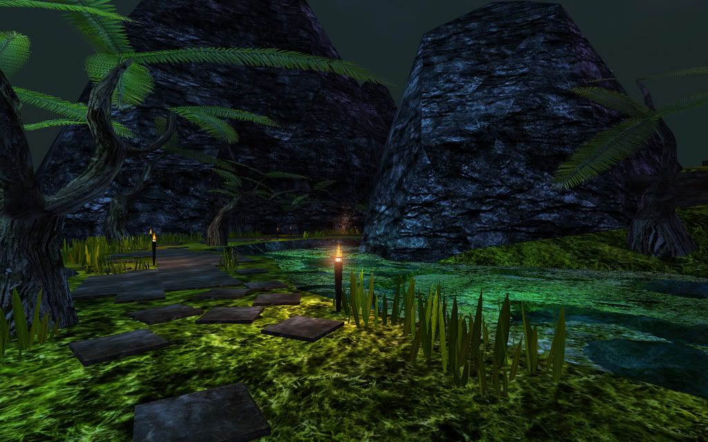
MartinW wrote:Don't reduce the colors' intensity, the strong colors are what helps to create that distinct feeling of a tropical place, a warm summer night somewhere in a hidden and sacred corner on Na'Pali. A safe haven.
Kaka wrote:The map looks exactly the same in game, and i made it this way on purpose, so some of you might feel disapointed because I won't be changing the lighting style
yeah, don't change the lighting.. I LOVE it.
And as Sana says.. it's just different than Waff's work.. will bring a lot of variety in the results of the competition.. can't wait till all is done!!
- Kaka
 Skaarj Berserker
- Posts: 475
- Joined: 12 Nov 2007, 00:21
- Location: Trójmiasto
- Contact:
Subject:
Post Posted: 14 Jul 2009, 00:03
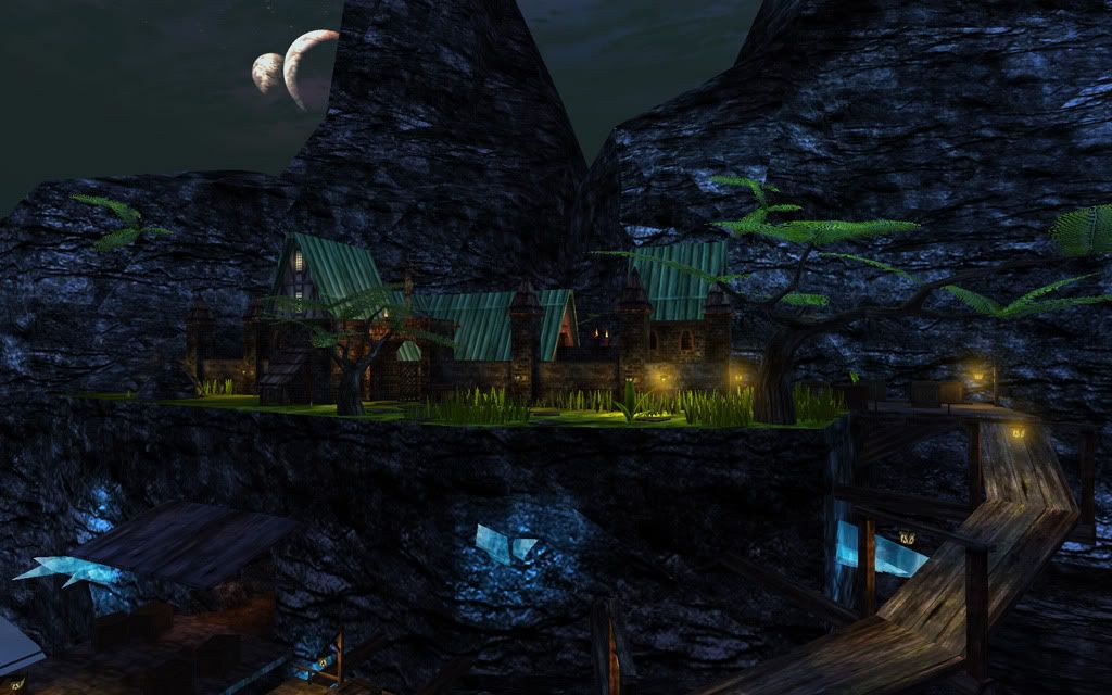
Actually I had to change the lighting a bit - see shots below - that kind of intense saturated light didn't mix well with some parts of the map which a little bit different approach when it comes to lights - but i think it still looks good ( the hell it looks fucking awesome lol, but more natural ).
-
 Hellscrag
 Founder
- Posts: 4007
- Joined: 11 Nov 2007, 19:14
- Location: In a random access memory of dreams
Subject:
Post Posted: 14 Jul 2009, 00:10
Nice. Would it be possible to make it a tiny bit darker, so that the torches have more impact? (it may just be the gamma / my screen brightness)

Life is what you make of it.
- Kaka
- Skaarj Berserker
- Posts: 475
- Joined: 12 Nov 2007, 00:21
- Location: Trójmiasto
- Contact:
Subject:
Post Posted: 14 Jul 2009, 00:16
This part is lit by two blue moons so that's the reason torches don't give much light but in the other side of the map there's less light from the sky and torche lights look a lot warmer. And it's still WIP so i probably will enhance lights when I'm done with the build.

 Skaarj Warlord
-
 gp
gp
 Skaarj Assassin
- Posts: 106
- Joined: 22 Dec 2007, 23:16
Subject:
Post Posted: 14 Jul 2009, 01:20
I am really looking forward to this one, and am in full agreement with the others that have said it has a great style.
Indeed.
Legendslayer222 wrote:[...]this competeition, there are some fine maps going.
Indeed.
Who is online
Users browsing this forum: No registered users and 87 guests